[wiki:FsTutorial top] | [wiki:FsTutorial/GroupAnalysis previous] | [wiki:FsTutorial/FslFeatFreeSurfer next]
= TUTORIAL LOCATION HAS MOVED = Good news for those of you who are confused by FSGD files, and mri_glmfit commands: There is a new group analysis tool in Freesurfer, Qdec. To accompany this tool there is also a new group analysis tutorial.
Please seethe new group analysis tutorial, using Qdec ["QdecGroupAnalysis"]
Visualization and Inspection of Group Analysis Results
To follow this exercise exactly be sure you've downloaded the [wiki:FsTutorial/Data tutorial data set] before you begin. If you choose not to download the data set you can follow these instructions on your own data, but you will have to substitute your own specific paths and subject names.
The statistical parametric map created from the group analysis can be loaded into [wiki:FsTutorial/TksurferInterface tksurfer] for visualizing as an overlay on the average surface, and inspecting either vertex-by-vertex, or within a defined region of interest (ROI). In particular, tksurfer is able to configure the colormap, to threshold the statistical parametric map and to plot correlation between classes or variables for both a single vertex and ROI. In these exercises, tksurfer will be used to visualize and inspect results in a number of ways.
Visualizing and plotting
Using the precomputed average surface, the following exercise shows how to load the statistical parametric map as an overlay in tksurfer, how to configure the colormap and threshold the parametric map, and how to plot correlation dynamically while interactively clicking surface vertices. The example below demonstrates how to view the pre-computed result from the left hemisphere (lh) mapping. To view the right hemisphere (rh) result, replace lh with rh in the commands and file names below.
In this example, the statistical parametric map will be overlayed onto the average surface. Before you begin you should be sure your SUBJECTS_DIR is set appropriately:
setenv SUBJECTS_DIR $FREESURFER_HOME/subjects/buckner_data/tutorial_subjs/group_analysis_tutorial
cd $SUBJECTS_DIR
To load the average surface into tksurfer, run the following commands:
tksurfer average lh inflated
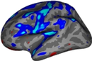
Tksurfer will display a dark grey inflated surface in its display window. You will probably find it easier to have a curvature file loaded when you look at the statistical maps. To load in the lh.sulc file hit ctrl and right click the curvature button attachment:icon_curvature.gif and type lh.sulc into the dialogue box. Then load the lh map as an overlay: from the tools window, load in file stats/lh.gender_age.glmdir/age/sig.mgh in the stats directory by hitting ctrl and right clicking the overlay button attachment:icon_overlay.gif. Check the button that says "Calculate Identity Matrix". The display window should look something like the image shown below. The surface and overlay can be viewed from different angles in the Display Window by clicking tksurfer's orientation icons.
attachment:group_results.jpg
Next, load FSGD file lh.gender_age.glmdir/y.fsgd in the same directory by selecting File -> Load Group Descriptor File. At first, an empty plot will be displayed in a separate window. To generate a plot for a particular vertex, select a point by clicking on the parametric map at that vertex and the plot window will be updated accordingly. Rolling the mouse over data points on the plot will display the corresponding subject ID. Take some time to plot and inspect results for different vertices, both in significant regions of the parametric map and elsewhere. The plot window should look something like the image below:
attachment:scatter_plot.jpg
Thresholding and Setting the Color Scale
The parametric maps's colormap can also be configured for display by selecting View -> Configure -> Overlay. This action brings up a new GUI panel which displays a histogram of the overlay's values, and allows values for min, max, mid and slope to be set as shown below. Experiment with these settings to see how they affect the display.
When setting a color scale, you're basically interested in two things: the threshold (ie, the value below which the voxel will be transparent), and the saturation point (ie, the value beyond which the color will not change). In tkmedit/surfer, there is an extra degree of freedom which allows the color scale to be divided into two parts, each with a different rate of color change. This extra flexibility is more of a curse than a benefit as most people are only interested in having a uniform change in color across the color scale.There are three color scale parameters in tkmedit/tksurfer:
fthresh - the value below which no color is shown ("Min" in the control panel)BR fmid - the value at which the color gets to its midpoint ("Mid" in the control panel)BR fslope - the slope of the colorbar above fmid ("Slope" in the control panel)BR
The color scale will saturate at fmid + 1/fslope. fthresh is the threshold mentioned above. To assure that the color scale will be uniform, set:BR
fmid = (saturation + threshold)/2 BR fslope = 2/(saturation - threshold)BR
Note that this forces the slope between fthresh and fmid to be the same as between fmid and the saturation level.
The meaning of these thresholds depends upon the nature of the data you have loaded as the overlay. Eg, the map you are currently viewing is -log10(p), where p is the significance, so a threshold of 2 will display all vertices with p<.01.
attachment:configure_overlay.jpg
False Discovery Rate Thresholding
False Discovery Rate (FDR) is a method used to set the vertex-wise (or voxel-wise) threshold (ie, fthresh above) based on the risk of False Discovery that the user is willing to accept. The False Discover Rate is the number of vertices falsely declared active as a proportion of the number of TRULY ACTIVE vertices. Thresholding based on FDR is usually less consertative than False Positive Rate (FPR) methods such as Bonferroni correction. The Bonferroni FPR is the number of vertices falsely declared active as a proportion of the TOTAL number of vertices (active or not). The FDR threshold is based on the data and so can change from data set to data set. For more information on FDR see : Thresholding of Statistical Maps in Functional Neuroimaging Using the False Discovery Rate. Genovese, Lazar, Nichols. NeuroImage 15:870-878, 2002.
FDR is built directly into the tksurfer interface. To use it, choose your desired FDR, enter it into the the FDR entry box and hit "Set Threshold Using FDR". tksurfer will compute the threshold needed to realize this FDR. See how the Min threshold changes. Hit "Apply" to change the threshold applied to the map. Note: the values in the map MUST be -log10(p-value). This is the form of the output from mris_glm.
Defining a region of interest (ROI)
Tksurfer has the ability to compute and display statistics averaged over a defined region of interest (ROI), which is another popular way to test statistical hypotheses. The following exercise shows how to define, fill, select and plot statistics for an ROI. To define a label that marks a region of interest (ROI) on the surface, first right click in the graphics window to clear any marked vertices. To outline the region that the label should be drawn, make a series of left clicks on the surface. Then click the "Make Closed Fill Boundary" icon in the tools window attachment:icon_filled_boundary.gif. This should connect the points you clicked, drawing a yellow or red line between them. If it seems to hang for a while, press Ctrl-c to cancel the line and try again. The ROI should look like the one shown outlined in red in the image below:
attachment:tksurfer-roi-closed2.jpg
To fill the label, click once in the middle of the polygon and then click on the "Custom Fill" icon attachment:icon_custom_fill.gif. This action will raise a dialog box with several fill options. Select the one that says "Up to and including paths" and then click the fill button. As a result, the ROI should appear like this:
attachment:tksurfer-roi-filled2.jpg
In order to plot statistics averaged over this new ROI, first select the label using Tools -> Labels -> Mark Selected Label. Tksurfer indicates that the ROI is selected with the label's background color turns to white as shown below:
attachment:tksurfer-roi-selected2.jpg
Now select Tools -> Group -> Graph Marked Vertices Avg to update the plot with the data averaged over the selected ROI:
attachment:tksurfer-roi-plot.jpg
Finally, save an image of this plot to a TIFF file for including in a publication or presentation: select Tools -> Group -> Save Plot to Postscript File. Also save the plot data to a table in a tab-delimited format for analysis using other software packages, select Tools -> Group -> Save Plotted Data to Table.
Mapping an ROI from one subject to another
After defining an ROI(<labelname>) on a subject(<source>), that ROI can then be mapped to another subject(<target>) with the command:
cd $SUBJECTS_DIR
mri_label2label --srcsubject <source> --srclabel <source>/label/<labelname> --trgsubject
 <target> --trglabel <target>/label/<labelname> --regmethod surface  --hemi <hemi>